

Case Study 03 // Elevating a Mattress Brand
Elevating a Mattress Brand to Premium
01 // System Overview
Elevating a Mattress Brand from Craftsmanship to Premium
Existing trust doesn’t automatically extend to a new price point.
Happi Foam had already secured funding to scale its operations, but the market hadn’t caught up. Existing customers trusted the product, yet struggled to square the higher prices and improved quality with the brand they thought they knew. Prospective premium customers, meanwhile, had no reason yet to see Happi Foam as a serious, premium name.
That tension shaped our approach. Rather than build an entirely new identity from scratch, we advised the client to elevate Happi Foam, already one of their most recognised product names, into the premium brand name itself, and use the parent company as an endorsement behind it. This meant existing customers weren’t being asked to trust something unfamiliar, they were watching a name they already knew step up in standing.
That thinking is what produced the line: “Happi Foam, a brand of Solar Foam and Chemical Industries Limited.” The endorsement did the reassuring, while the Happi Foam name carried the ambition, giving the business a premium identity that prospective customers could take seriously, without asking existing customers to start over on trust.
02 // Strategic Pathway Discovery Matrix
Route A (Rejected) ✗
The clean-slate rebrand
Retire the Happi Foam name entirely and build a new premium name from scratch. On paper it solves the perception problem cleanly, since a new name carries no old associations. But it discards the one asset the business had already earned, which is recognition. It would have meant building trust from zero in a market that already trusted the product. We set this route aside early.
Route B (Rejected) ✗
The corporate-led rebrand
Lead with the parent company, Solar Foam and Chemical Industries Limited, and position Happi Foam as a product beneath it. It is a common instinct, since corporate names can signal scale. But it fails on familiarity. Customers did not walk into a shop asking for the parent company, they asked for Happi Foam. Leading with an unfamiliar name asks people to trust twice.
Chosen Framework ✓
The name people already trusted had to lead
One narrow question shaped the identity: which name does a customer already reach for? Existing buyers did not need introducing to Happi Foam, they needed reassurance it had grown up. So Happi Foam was elevated to carry the premium experience, while the parent company moved behind it as an endorsement, lending credibility without asking anyone to relearn trust.
“A name does not become premium because it is announced. It becomes premium because the customer already trusts the name standing behind it.”
– Skill & Sketch Strategic Team
By elevating the product name customers already trusted and positioning the parent company as its endorsement, we helped the market move from doubting the change to recognising it.
03 // Some Real-World Tactical Assets
Skill & Sketch developed a complete brand repositioning system built around one method: elevate the product name, endorse it with the company. It was expressed through a new logo and visual identity, a brand slogan, and a Brand Identity Guideline for consistent stakeholder use. The system gave Happi Foam one credible, premium presence at every point customers encountered the brand, from packaging to dealer touchpoints.
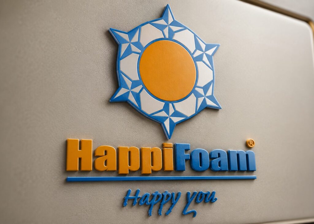
Logo Design
The new HappiFoam mark pairs a bold sun emblem with confident typography, signaling the brand’s shift into premium spaces.
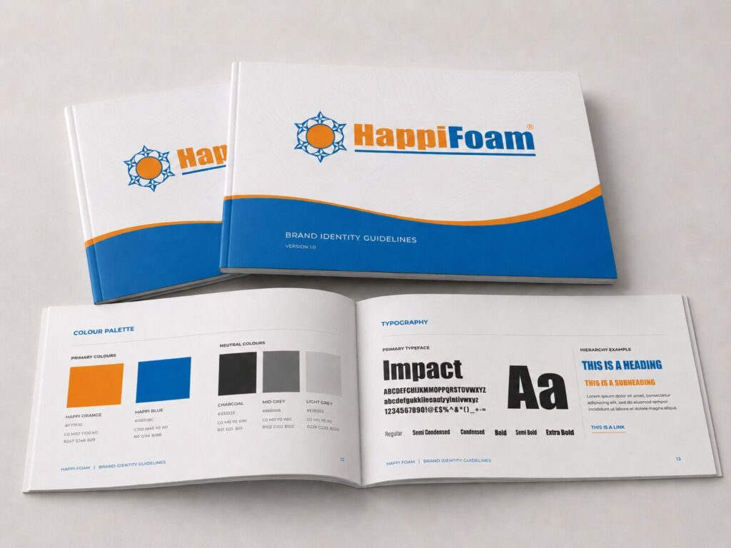
Brand Identity Guidelines
The guideline sets out the full visual system — palette, typography, logo usage — giving every stakeholder one consistent reference.
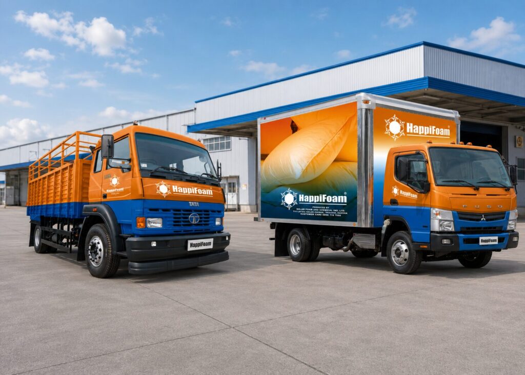
Distribution Trucks Concept
Fleet livery applies the identity to delivery trucks, turning every trip into a moving brand touchpoint and recognition builder.
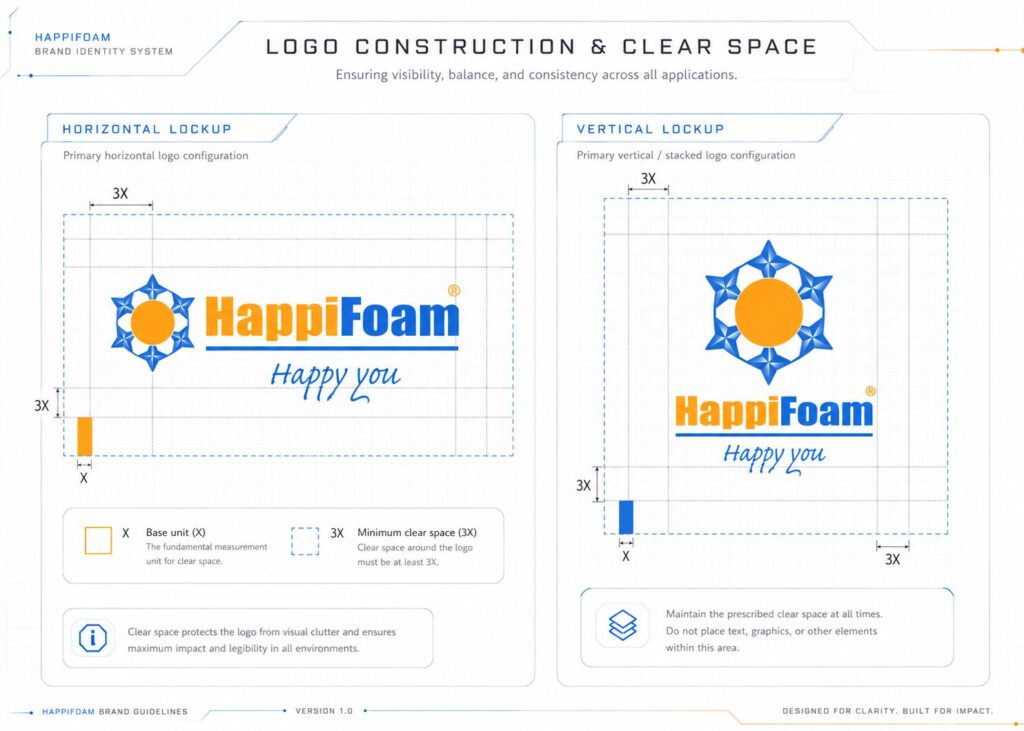
The Logo Clear Space
Construction and clear-space guidelines define minimum spacing and proportions, protecting the mark’s legibility across every application.
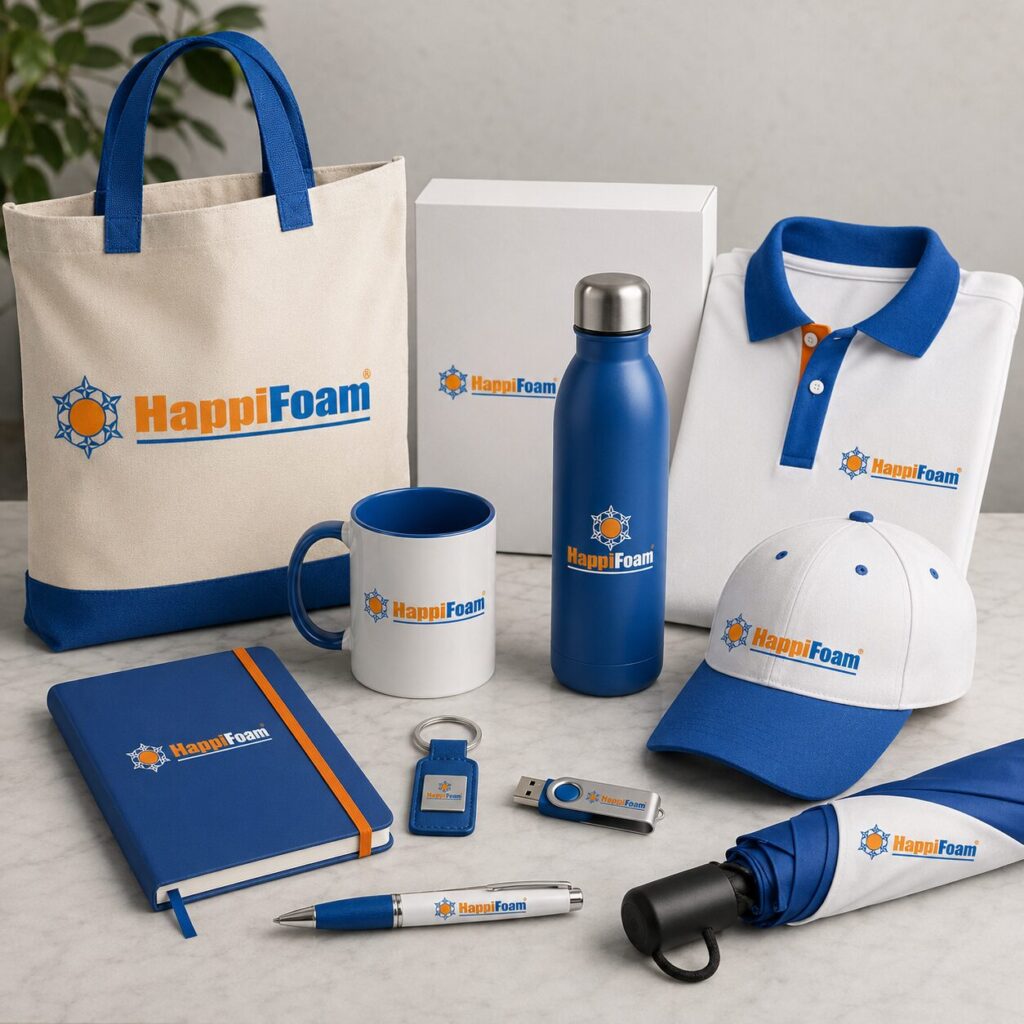
Corporate Givaways
Branded merchandise, from totes to apparel and USB drives, extends the identity into everyday corporate gifting and recognition.
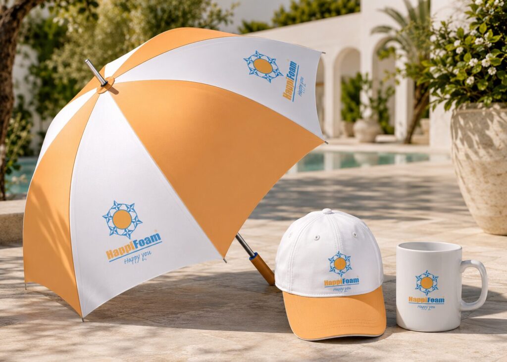
More Giveaways
Outdoor and lifestyle items, including umbrellas and caps, carry the identity beyond the office into everyday settings.
04 // Performance Verification
A rebrand means nothing until it is tested in the market. These numbers track what actually shipped: how the identity was delivered, how much of the system it covered, and whether it moved the needle once customers saw it.
WEEKS TO DELIVERY
Brand direction, visual identity, slogan, and the Brand Identity Guideline completed within a single repositioning engagement.
Brand system components
Brand direction, visual identity, slogan, guidelines, and a premium perception system delivered as one connected identity.
Sales growth, branding-attributed
A share of Happi Foam’s post-launch sales growth attributed to the repositioning, alongside stronger customer perception of quality and credibility.
Is your brand ready to earn premium trust?
A trusted product name was elevated into a premium brand people already believed in. Let’s do the same for your next repositioning.
05 // Frequently asked questions
Answers to the questions prospective clients most often ask about elevating a trusted product into a premium brand.
Yes. Solar Foam and Chemical Industries Limited remains the manufacturer behind Happi Foam, and that relationship is written directly into the brand line: “Happi Foam, a brand of Solar Foam and Chemical Industries Limited.” Rather than hide the parent company, we used it as an endorsement, lending credibility to the premium repositioning without asking customers to learn a new name.
By changing what surrounds the name rather than the name itself. Logo, packaging, and brand presentation were elevated to premium standards, while the core identity customers already trusted stayed intact, so the message read as the same brand, grown up, rather than a different, unfamiliar company.
A complete brand system, including brand direction, a new visual identity, a slogan, and a Brand Identity Guideline for consistent use across packaging, retail, and stakeholder materials, built to work together as one coherent premium presence rather than isolated assets.
Because it was already the business’s most valuable asset. Existing customers recognised and trusted the name; a brand-new identity would have meant rebuilding that recognition from zero. Elevating the name customers already used let the repositioning carry existing trust forward instead of discarding it.
No, the underlying principle applies to any business moving upmarket while keeping an existing customer base. Wherever a brand already has recognition and trust, and needs to signal a new standard without starting over, endorsement-led repositioning usually beats replacing the name outright.
The engagement ran across an eight-week sprint in 2012, from initial strategic direction through to the finished identity and guidelines, ready for the client to roll out across the business.