

Case Study 05 // Premium Tea Branding
Building a Premium Tea Brand Nigeria Could Call Its Own
01 // System Overview
Building a Premium Tea Brand Nigeria Could
Call Its Own
A great leaf doesn’t sell itself. A brand has to make the case for it.
African Blend & Infusions Limited wasn’t starting from nothing. It had genuine agricultural credibility: tea grown, harvested, and processed on Nigeria’s own Mambilla Plateau, one of the few places in the country capable of commercial tea cultivation at that altitude. What it lacked was a brand system built to match that credibility — an identity, packaging, and presence capable of standing next to imported tea brands on a Nigerian shelf and winning.
That gap shaped our approach. Premium tea is bought on trust before it’s ever tasted, and that trust is built almost entirely through what a customer sees: the name, the pack, the story it tells at a glance. Rather than treat this as a packaging job, we built a connected system: a brand identity strong enough to anchor the whole range, a name worth remembering — one the client themselves arrived at once we pointed the search toward the brand’s own origin — and a packaging and guideline system built to carry that identity consistently across every variant and every touchpoint.
That thinking is what shaped everything downstream: not just the pack design, but the guideline book, the calendars, and the collateral built to carry the brand into homes, offices, and retail shelves alike. Identity created credibility. Packaging created shelf presence. The guideline system made sure both held together as the range grew. Together, they gave African Blend & Infusions Limited a brand built to match the quality already in the leaf.
02 // Strategic Pathway Discovery Matrix
Route A (Rejected) ✗
Keep the product names as they were
Leave Mambilla Black Tea, Mambilla Green Tea and the rest as standalone product names under African Blend Organic. It’s the safer, lower-effort path — no rename, no disruption to what customers already recognised. But it left the business without one brand strong enough to carry the whole range, build shelf authority, or grow beyond individual product labels. Each pack worked alone; none of them built the business.
Route B (Rejected) ✗
Invent a new name unrelated to the product range
Start fresh with an entirely new, invented brand name chosen for sound and shelf appeal rather than anything already true of the business. It’s a common premium-branding move, but it would have meant abandoning the recognition Mambilla already carried at product level, and building meaning from zero, at real cost, with nothing existing to build on.
Chosen Framework ✓
The name had to build on what was already true
“A brand isn’t built by naming products well. It’s built by giving them one story to belong to.”
– Skill & Sketch Strategic Team
BY BUILDING THE MASTER BRAND AROUND A NAME ALREADY PROVEN IN THE PRODUCT RANGE, WE HELPED AFRICAN BLEND & INFUSIONS LIMITED MOVE FROM A SET OF SEPARATE PRODUCT NAMES TO ONE BRAND WITH ITS OWN STORY, CREDIBILITY, AND STAYING POWER.
03 // Some Real-World Tactical Assets
Skill & Sketch built a connected brand system around one method: identity creates ownership, packaging creates shelf trust, guidelines create consistency. It was expressed through a consolidated brand identity, a full packaging system across the tea range, a comprehensive brand guideline book, and a range of print and promotional materials, from calendars to collateral. The system gave 1961 Mambilla one consistent, credible presence at every point customers encountered the brand, from the shelf to the boardroom to the desk at home.
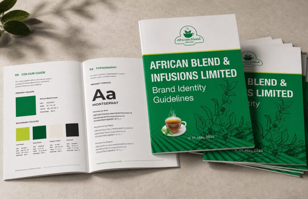
Brand Identity Guidelines
The guidelines define the full visual system — palette, typography, logo usage, and tone — for every stakeholder to follow.
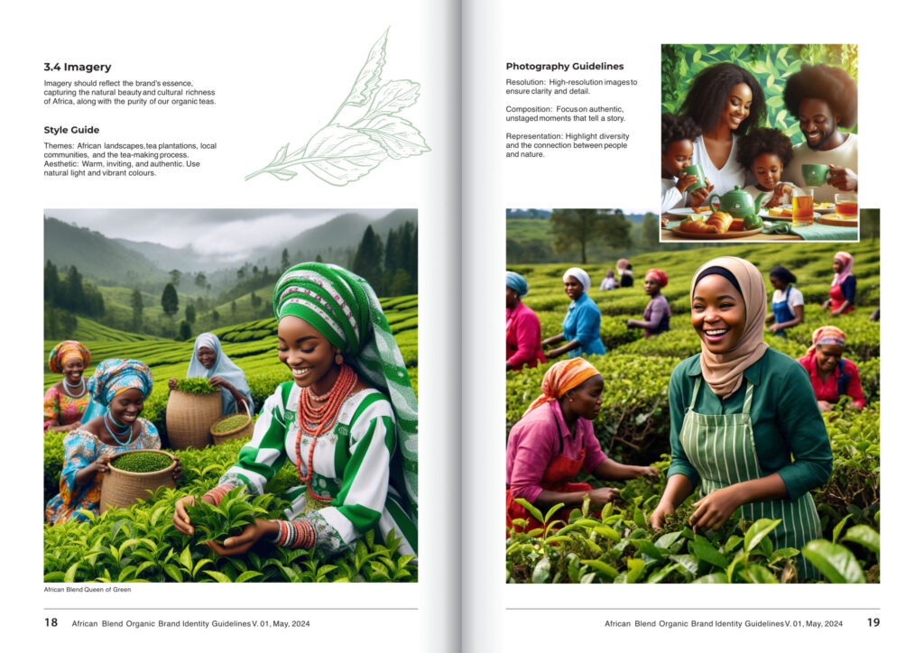
Photography Style
The 1961 Mambilla style captures tea pickers at work on the Plateau, grounding the brand in authentic origin.
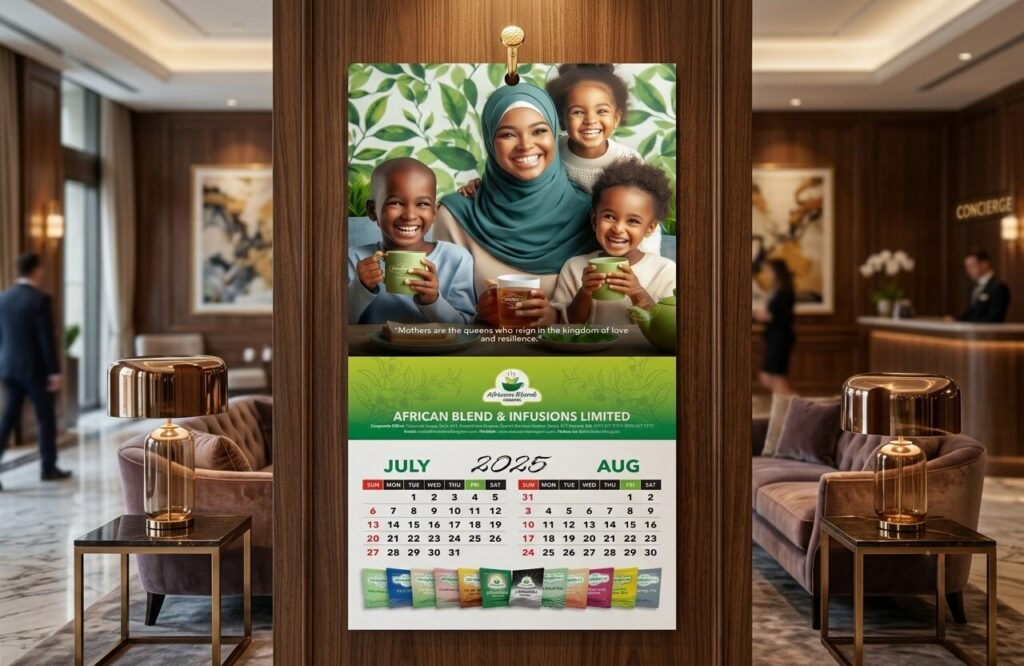
Promotional Calendar
The wall calendar carries the brand into homes, offices, and hotels year-round, turning a simple gift into a reminder.
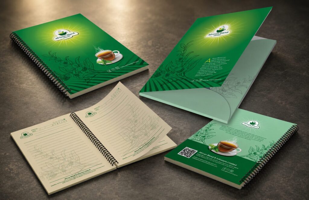
Stationery & Print Collateral
Notebooks, folders, and print collateral carry the African Blend green identity into every meeting, desk, and partner interaction.
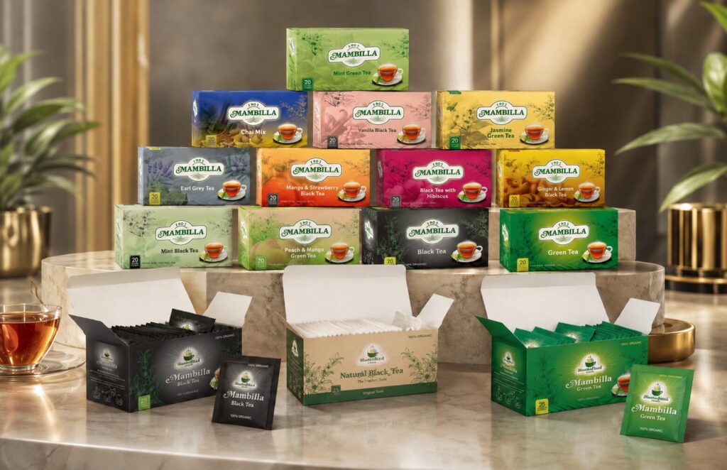
Mambilla Tea Pack Collections
The full range spans black, green, and flavoured infusions, sharing one pack architecture so it reads as one brand.
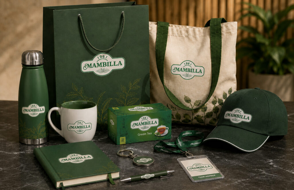
Corporate Giveaways
Water bottles, mugs, notebooks, and bags all carry the Mambilla mark — turning everyday items into consistent brand reminders.
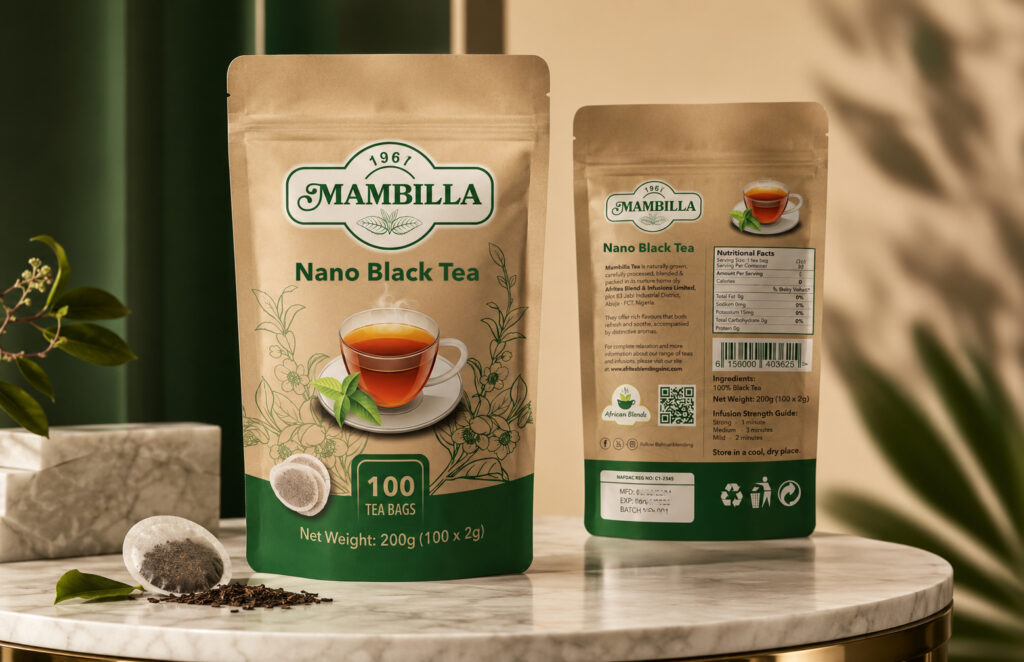
Mambilla Nano Black Tea 100
Built for high-volume use, the Nano Black Tea 100 scales the flagship identity into a bulk format for businesses.
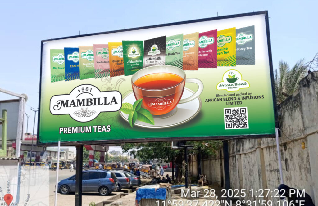
Billboards
Outdoor billboards carry the full product range and identity into public spaces, extending recognition before customers reach the store.
04 // Performance Verification
A brand system means little until it’s lived in daily. These numbers track what actually shipped: how long the partnership has run, how many touchpoints the system covers, and how far the brand now reaches.
MONTHS OF PARTNERSHIP
From the 2023 brand consolidation to ongoing packaging, guideline, and collateral work, an active brand relationship built over two and a half years and counting.
TEA VARIANTS PACKAGED
Every product in the 1961 Mambilla range carries one consistent identity system, from 1961 Mambilla Earl Grey to 1961 Mambilla Mint Green Tea to the full range beyond.
MARKETS IN DEVELOPMENT
Abuja live today, with nationwide retail and West African distribution built into the brand system as the business scales.
Is Your Brand Worthy
of the Leaf?
A complete system of identity, packaging and guidelines gave
1961 Mambilla one credible presence from the plantation to the shelf. Let’s build that for your brand.
05 // Frequently asked questions
Answers to the questions prospective clients most often ask about building a premium brand from the ground up.
1961 Mambilla is the master brand of African Blend & Infusions Limited, consolidating what were previously separate product names, including Mambilla Black Tea and Mambilla Green Tea, into one identity. The brand work was built to unify the range under a single name, not replace the company behind it, giving African Blend & Infusions Limited one consistent identity customers can recognise across every product.
Separate product names meant separate recognition. A customer who knew Mambilla Black Tea had no reason to trust or even notice Mambilla Green Tea sitting next to it on the shelf. Consolidating around 1961 Mambilla meant every product now builds the same brand equity, so recognition earned by one variant carries over to the next, and the range reads as one credible producer rather than several unrelated labels.
The system covers pack design across the full 15+ variant range, a comprehensive brand guideline book setting out colour, typography, logo use and pack architecture, and the supporting print materials, calendars and collateral needed to carry the identity beyond the shelf. Every element was built to work as one connected system rather than one-off designs.
Consistency starts with the guideline book, not the packs themselves. Before any individual pack was designed, we set the fixed elements, logo placement, colour system, typography, pack architecture, so every variant shares the same bones and only the flavour-specific details change. That structure means the range can keep growing without the brand drifting.
Because the range was always going to grow. A startup with one or two products can get away with ad hoc design decisions; a startup planning 15+ variants and national distribution cannot. Building the guideline system early meant every new product, print run and retail placement since has stayed consistent, instead of the brand needing an expensive correction once inconsistency had already reached the shelf.
No. The underlying method, consolidate scattered identity into one ownable brand, build a system rather than individual assets, and set guidelines before scale arrives, applies to any product-led business growing a range. Food and beverage simply makes the packaging stakes especially visible, since the brand has to earn trust at first glance, before a single product is ever tasted.