

Case Study 06 // Branding An ICT Company
Building an ICT Brand Nigeria Could Recognise
01 // System Overview
Building A Recognisable ICT Brand From Identity to Everyday Market Visibility
A logo can identify a company. It takes a full system to make that company trusted.
Micromanna Limited entered Nigeria’s ICT sector in late 2004 with real professional credibility: a team of experienced Nigerian computer professionals equipped to serve businesses, government agencies, hospitals, schools, banks, and financial institutions. What it didn’t yet have was a visual identity capable of carrying that credibility into a market that was growing more crowded and more competitive by the year.
In ICT, technical merit isn’t enough on its own. Customers need to believe the provider can organise complexity on their behalf before any solution is ever delivered — and that belief has to be visible before a single sales conversation happens. So the brief went beyond a logo: Micromanna needed a mark that could carry that belief on sight, and a system disciplined enough to repeat it everywhere the business showed up.
We designed a cube formed from a hexagon — a shape that reads as structure, containment, and solution capacity at a glance — then extended it across stationery, brochures, calendars, apparel, and packaging, so the same visual promise met customers wherever they encountered Micromanna. The mark opened the door. The eight years of collateral that followed kept it open.
02 // Strategic Pathway Discovery Matrix
Route A (Rejected) ✗
Use literal computing imagery
Build the mark around familiar ICT visual shorthand — circuit lines, monitors, motherboard patterns, or a stylised computer chip. It’s the expected route for a technology company, and it would have signalled “ICT” immediately. But literal computing imagery ages fast as hardware changes, and it says nothing about how Micromanna works with a client. It identifies the sector without building trust.
Route B (Rejected) ✗
Design an abstract mark with no fixed meaning
Choose a mark for its visual appeal alone — clean, modern, flexible enough to mean whatever the business needed it to mean over time. It’s a common approach in identity design, but it would have left Micromanna with a symbol that had to be explained rather than one that explained itself, at real cost to recognition in a market where trust has to be built quickly.
Chosen Framework ✓
Build the mark around what clients actually needed to believe
Computing feels complex to the people buying it. What they need is confidence that their provider can bring order to that complexity — organise it, contain it, deliver it reliably. Rather than illustrate the sector or design for appeal alone, we built the identity around that belief directly: a cube formed from a hexagon, a shape that reads as structure and containment before a customer even knows what Micromanna sells. The mark became a visual promise — a strong box holding dependable computing solutions — and every piece of collateral that followed was built to reinforce it.
“A brand is not remembered because it sounds good. It is remembered because it means something true.”
– Skill & Sketch Strategic Team
BY BUILDING THE IDENTITY AROUND WHAT ICT CUSTOMERS ACTUALLY NEEDED TO BELIEVE, WE HELPED MICROMANNA LIMITED MOVE FROM A NEW MARKET ENTRANT TO A BRAND WITH A CONSISTENT, RECOGNISABLE PRESENCE ACROSS NIGERIA’S ICT SECTOR.
03 // Some Real-World Tactical Assets
The system had to work as hard on a desk as it did on a delivery van. Skill & Sketch expressed the Micromanna identity through a core mark, a full stationery system, print collateral, promotional calendars, apparel, giveaways, and product packaging — each piece built to the same visual standard, so the brand looked like one company no matter which touchpoint a customer met first.
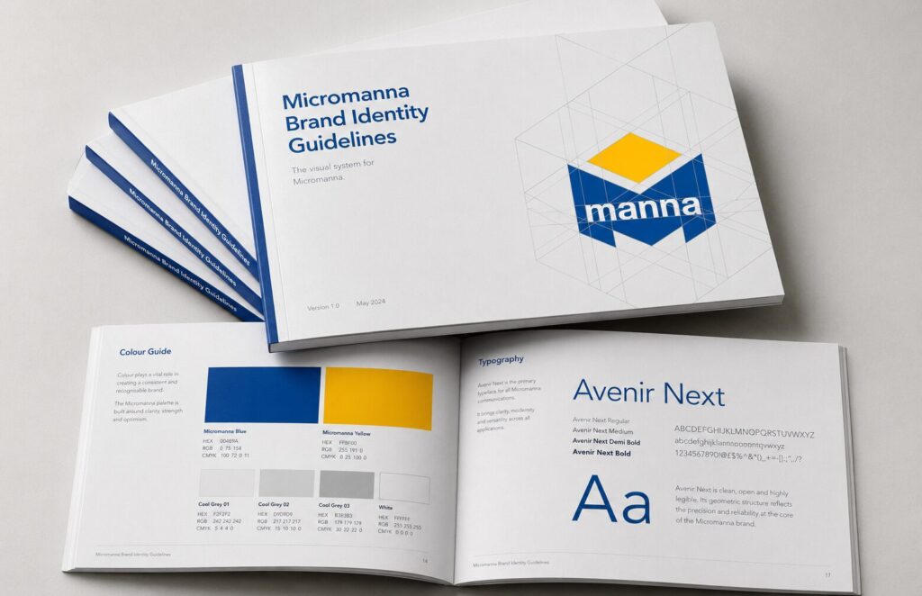
Brand Identity Design
A cube-from-hexagon mark signaling structure, strength, reliability, and capacity — the visual foundation anchoring everything Micromanna built.
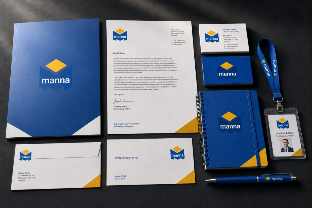
Stationery System
Letterheads, envelopes, invoices, business cards, and folders carrying Micromanna’s identity into everyday communication, turning routine paperwork into trust.
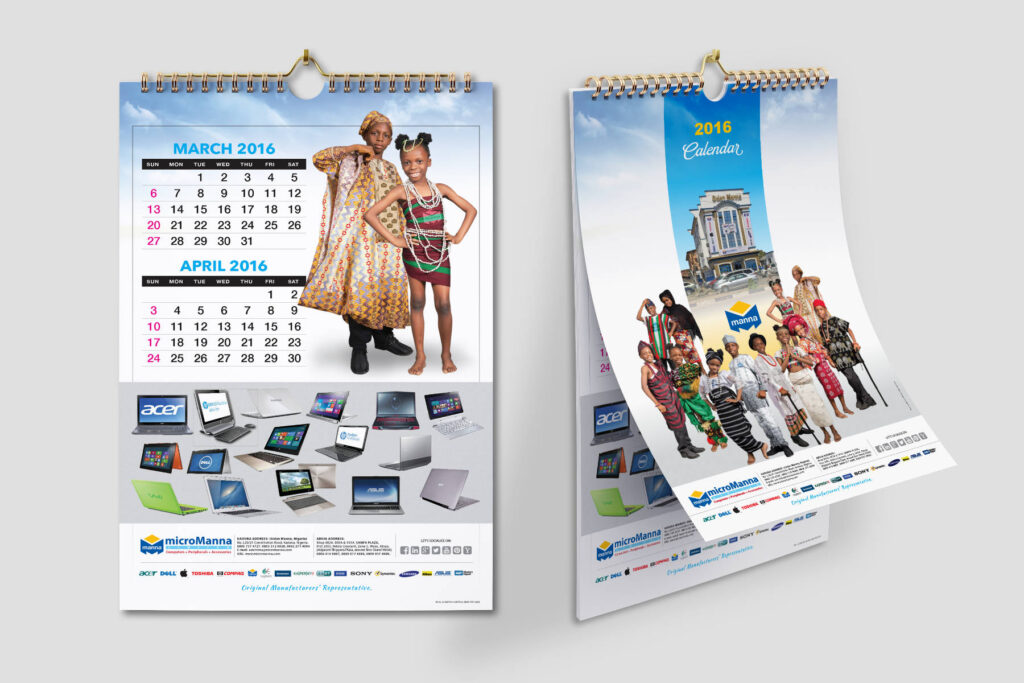
Uniquely Themed Calendars
Each year’s calendar paired Nigerian photography with Micromanna’s products, keeping the brand visible in offices and homes year-round.
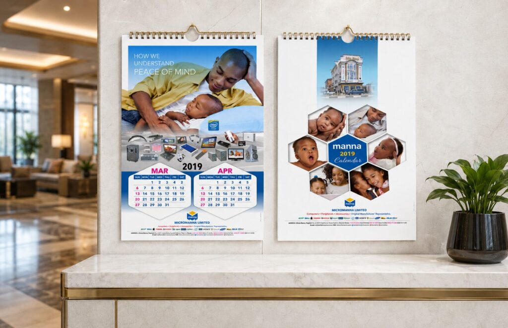
Promotional Calendars
Branded wall calendars carrying Micromanna’s identity into offices, homes, and shops — keeping the brand present without aggressive selling.

Corporate Giveaways
Branded apparel and giveaway items people could use, wear, and encounter daily — building brand recall through repetition.
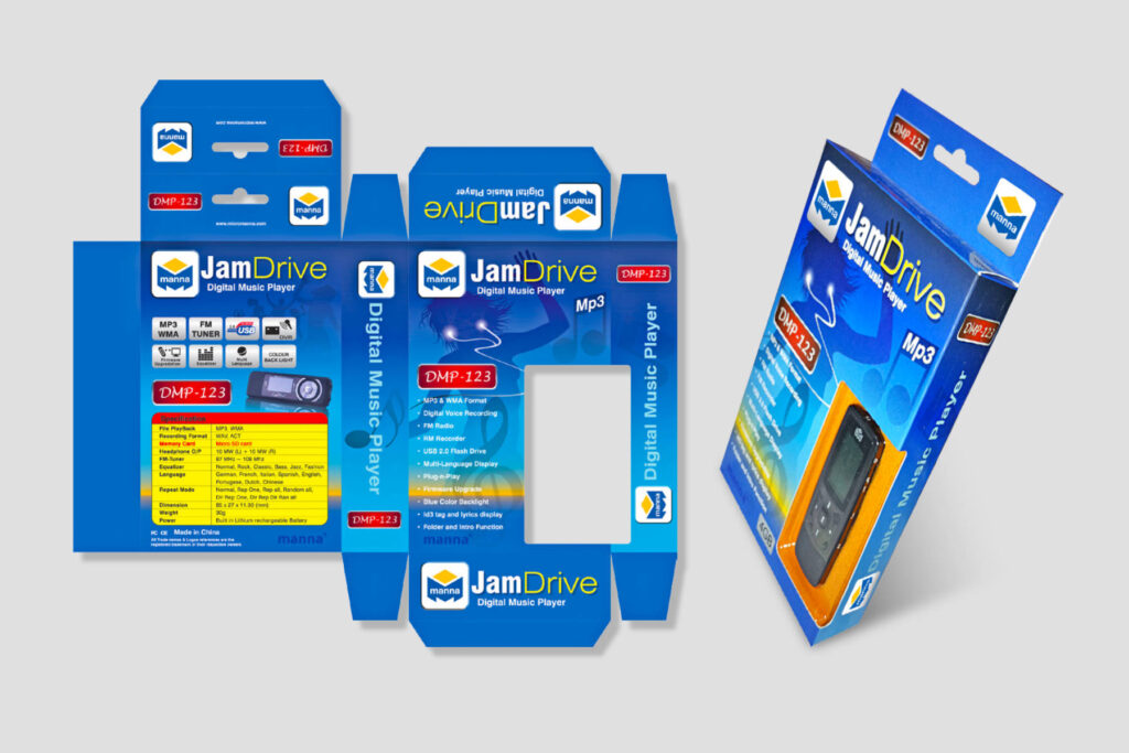
Product Packaging Design
Branded packaging for select Micromanna products, reinforcing recognition and professional credibility at every point of use.
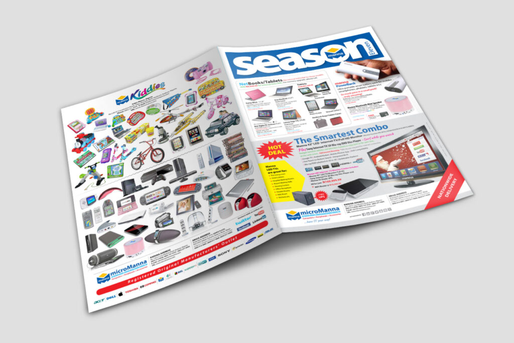
Below-the-Line Advertising
From 2004–2012, Skill & Sketch kept supporting Micromanna — proof of an ongoing partnership, not a one-off launch.
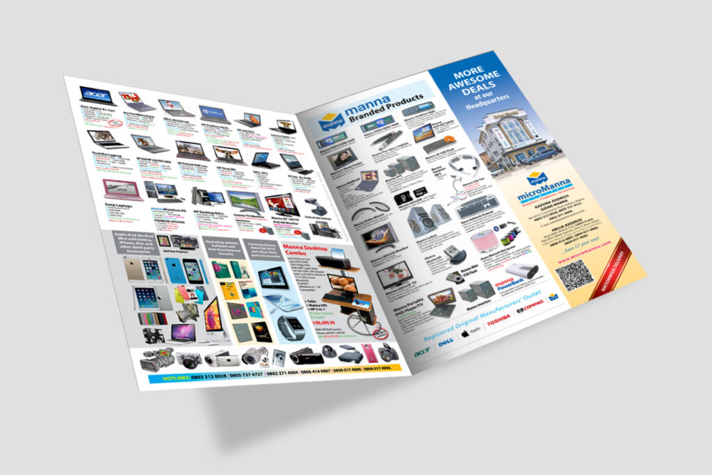
Brochures, Folders and Flyers
Print collateral explaining Micromanna’s products and position — supporting sales conversations with businesses, agencies, schools, hospitals, and finance clients.
04 // Performance Verification
Identity work is easy to claim and hard to sustain. These numbers track what Micromanna actually kept in the field: how long the relationship held, how many touchpoints carried the mark, and how wide a customer base it reached.
YEARS OF PARTNERSHIP
From the 2004 identity launch to ongoing collateral and advertising support, an active brand relationship sustained through 2012.
COLLATERAL TOUCHPOINTS
Stationery, brochures, folders, flyers, calendars, apparel, giveaways, and packaging — all carrying one consistent identity system.
CUSTOMER SECTORS SERVED
Businesses, government agencies, hospitals, schools, and financial institutions, all reached through the same consistent brand presence.
Does Your Brand Look As Reliable As Your Work?
A complete system of identity, collateral, and below-the-line advertising gave Micromanna one credible presence across Nigeria’s ICT market. Let’s build that for your brand.
05 // Frequently asked questions
Common questions from businesses considering a full identity and collateral system rather than a standalone logo.
A logo alone can identify a company, but it can’t build trust on its own. Micromanna needed a mark applied consistently across every customer touchpoint — stationery, brochures, calendars, apparel — so recognition could compound over time rather than reset with every new piece of collateral.
The shape was chosen for what it communicates before a customer reads a single word. A cube reads as structure and stability; a hexagon reads as strength and system. Together they form a container — visually suggesting a strong box that holds dependable computing solutions inside it. For an ICT company, that’s a more useful first impression than a literal picture of a computer or a chip.
Below-the-line materials did the work that a media campaign would otherwise do. Calendars stayed on office walls for a full year. Stationery moved through every client interaction. Apparel and giveaways travelled with the people who used them. None of it interrupted a customer’s day the way an advert does — it simply stayed present until the next time Micromanna’s services were needed.
For Micromanna, the system covered core stationery, brochures, folders and flyers, promotional calendars, apparel and corporate giveaways, and product packaging — all built from the same identity guidelines so a customer would recognise the brand regardless of which item was in front of them.
No. The method — build a mark around what your customers need to believe, then repeat it consistently across every physical touchpoint — applies to any business that depends on institutional trust to win and keep clients, from professional services to healthcare to finance. ICT simply made the need for that trust especially visible, early.
No. Micromanna’s identity launched first, and the collateral built up around it over time — stationery and print materials early, calendars and apparel as the relationship continued, packaging as the product range grew. A strong identity system is built to absorb new touchpoints as a business needs them, not to be deployed all in one go.